Introduction
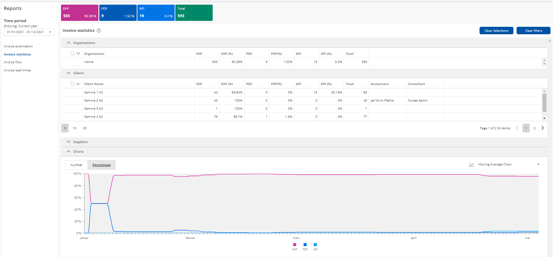
The invoice statistics report shows the percentage share and total number of different invoice formats arriving in Semine: "EHF", "PDF" or "API" over selected time periods. These statistics are accumulated on the organization level, client level, and individual supplier level

Time period
The user can select different standard time periods (current year, current month, current week etc) or a specific period. The tables, summary fields, and graphs will display the invoices received in this period.
Tables and columns
The user can expand and collapse all tables in the report. Further, filters can be applied or removed for individual table columns or all columns by clicking the "Clear filters" button. It is also possible to sort in all columns.
-
Organization table: Shows accumulated numbers and percentages for each received invoice format, in addition to a "Total" column, in the selected period on the organization.
-
Clients table: Shows accumulated numbers and percentages for each received invoice format, in addition to a "Total" column, in the selected period, for each client in the organization.
-
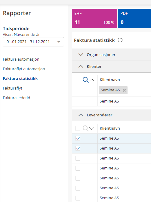
Supplier table: Shows accumulated numbers and percentages for each received invoice format, in addition to a "Total" column, in the selected period, for each seller and client in the organization. Users can select lines in the table, and the summary fields and graphs will adjust accordingly. Users can clear all selections by clicking on the "Clear Selections" button.
Summary fields

The summary fields display by default the accumulated numbers and percentages in the table for the "Current year" for the organization or for any selected suppliers. When one or multiple lines are selected in the "Suppliers" table, the summary fields will display accordingly. The figure is the number of this particular invoice format and the percentage is what this number is out of the total received invoices.
Graphs
By default, the graph will display the "Cumulative Moving Average chart" for the "Current year" for the organization. When one or multiple lines are selected in the "Suppliers" table, the graphs will display accordingly.
Cumulative Moving Average chart

The graph shows the Cumulative Moving Average for the currently selected time range in the "Time period". The user can also see the development in numbers, in the "Number" tab.
By clicking on the graph legend label or on the graph line, the selected line(s) will show at double line thickness and the other lines will display as dotted lines. When clicking on the legend label or graph line again, the graph will go back to the original display.
On hover over a line, the line will display as thicker, and a pop-up will show the label with the X-axis and Y-axis information.
By scrolling inside the graph, the user can zoom in or out on the X-axis.
Bar chart

The bar chart can be displayed as "Numbers" and "Percentage" on the Y-axis, and the user can zoom in on the x-axis to display this per day.
Pie chart

The pie chart can be displayed as "Numbers" and "Percentage" and will display the accumulated values for the period.

Comments
0 comments
Article is closed for comments.